Feltron Reports
My first reaction to most of the Feltron reports upon viewing them was: “Nope.” Most of the pages almost immediately sent me into information overload and I just couldn’t really understand 1) what I was looking at, 2) what the hell the point of these things were. When my power went out as I was looking at them, I felt it was a blessing. Life was saying “I wouldn’t want to have to do this either, so… here you go!” (and then it just got freezing cold in my house and instantly wished I could be working on the assignment as long as I could also have the heat running).
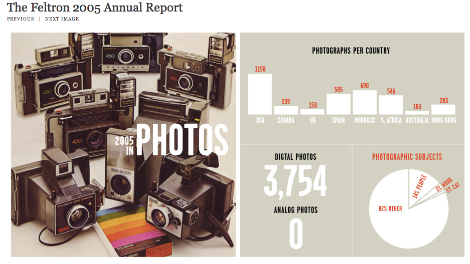
The first one I was able to look at without feeling like I wanted to bang my head against a wall was the 2005 Annual report. The layout is simple enough and tracks things that are much easier to follow. He tracks where he traveled, how many miles traveled, what music he listened to, books read, what kind of food he ate and what he drank, aaaand I could go on. The report is only a few images long, but the layout (I felt) was so much better than the others I had looked at.
All of the graphs are easy to see and the information isn’t overbearing.
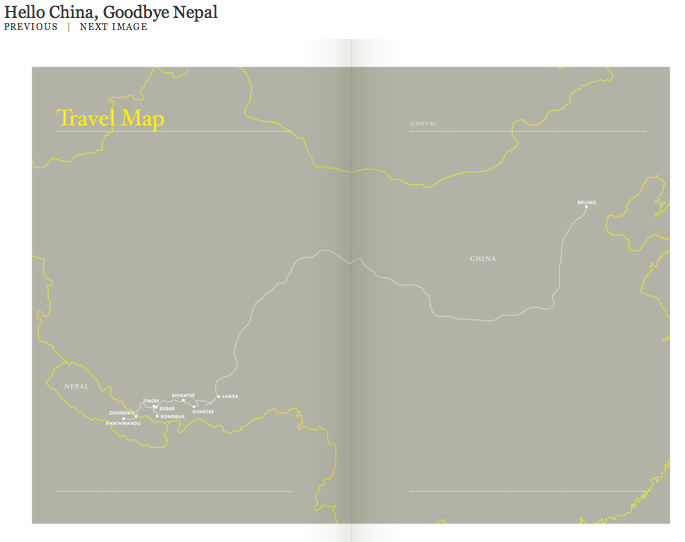
Then I decided to look at “Hello China, Goodbye Nepal.” Again, the layout is easy to follow and while there’s information presented, the report was mostly done in large-print numbers and pictures. (Sorry, that’s just so much easier for me to follow, I’m a visual processor and not a “million things thrown in my face at one time” learner). He includes flights taken, what he packed, and maps and pictures of where he went.
He also includes little entries like a journal at the beginning of each day.
I think the only thing I could complain about is that in this particular one, you can’t select any of the thumbnails of the pictures to view larger images, and I’d have really liked to!

